Hidden in Plain Sight: packaging design
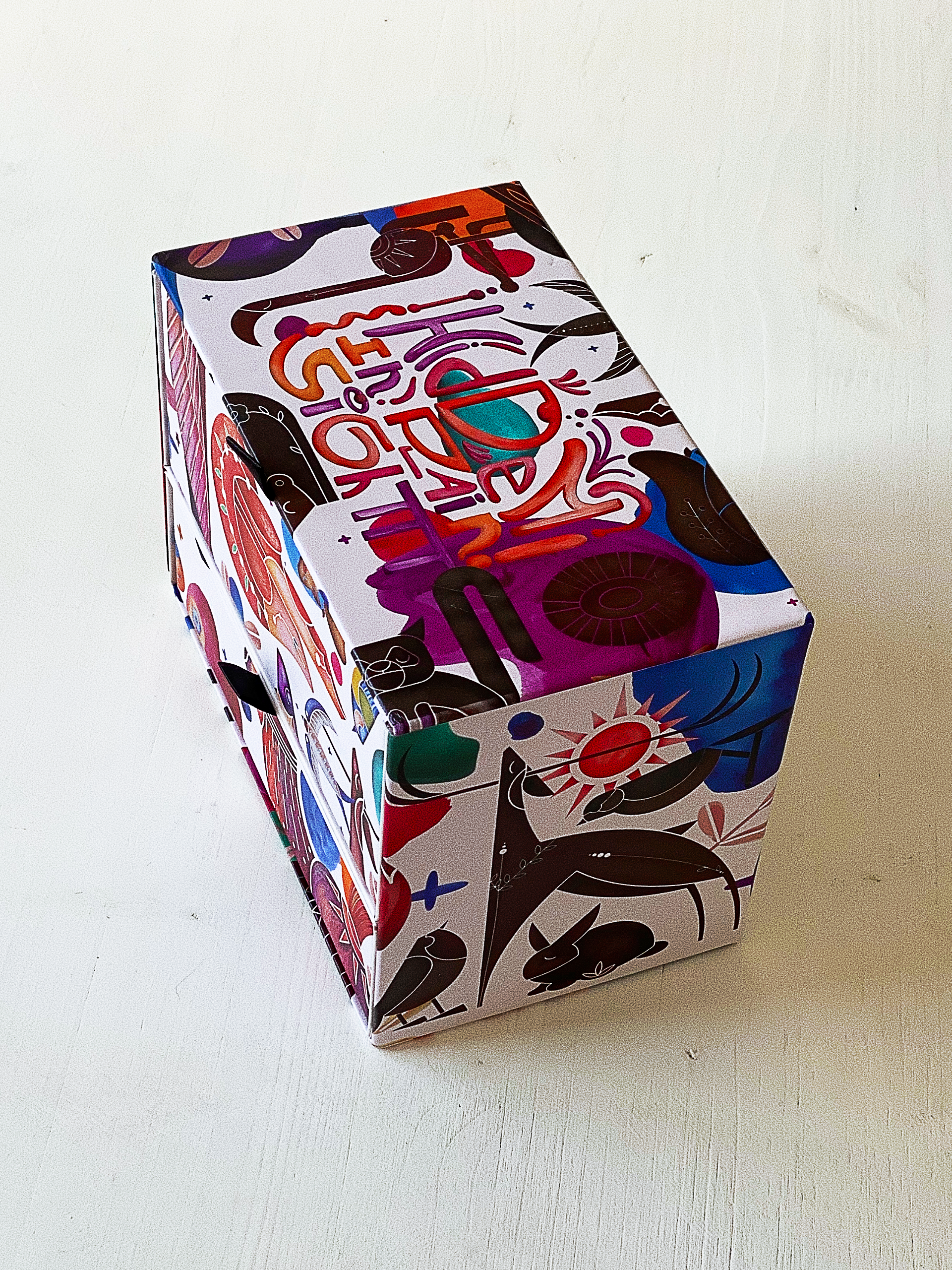
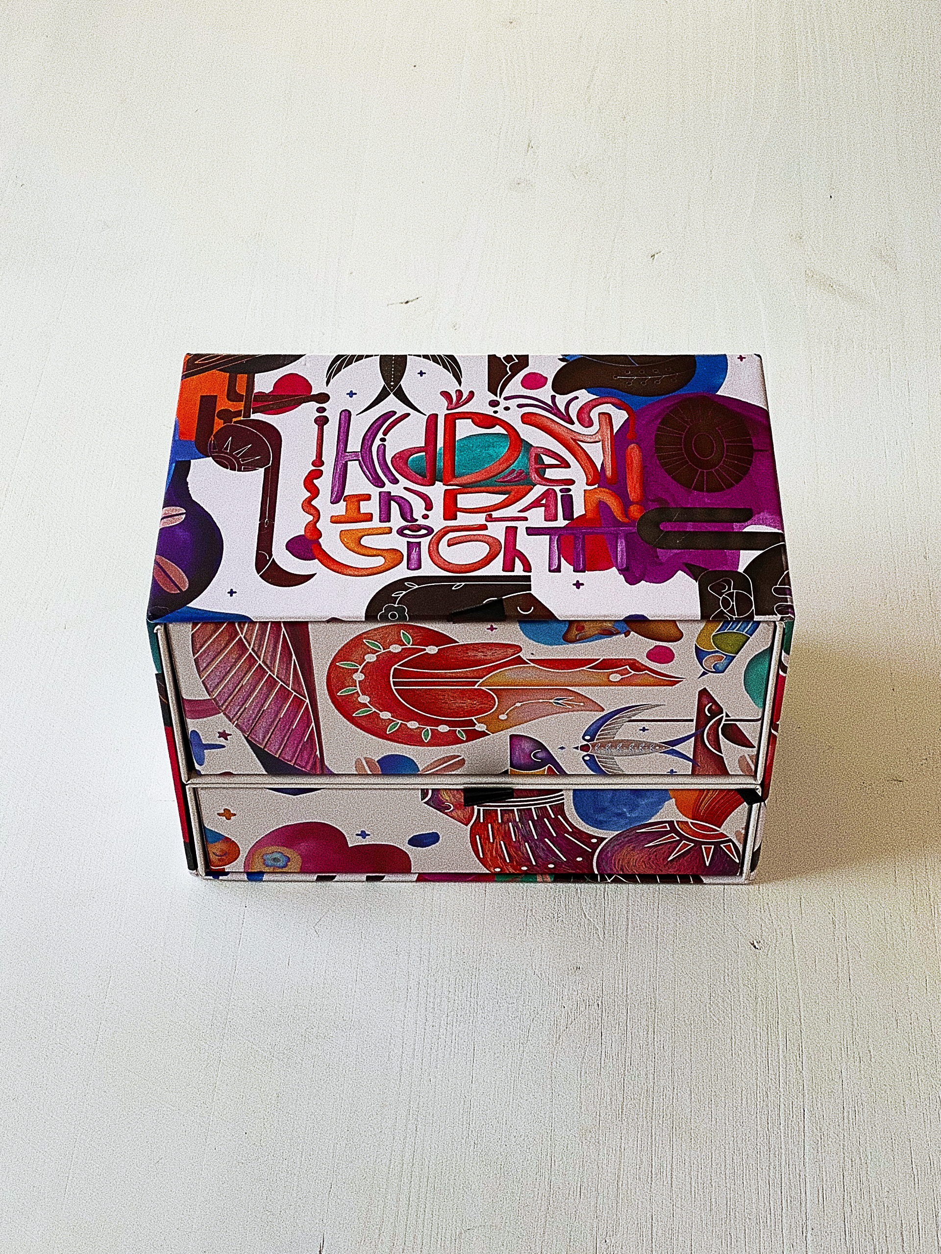
I was given the opportunity to create the packaging design for a really cool product that had a briliant idea in its core. The main concept was revolving around the message of beauty hiding in plain sight.
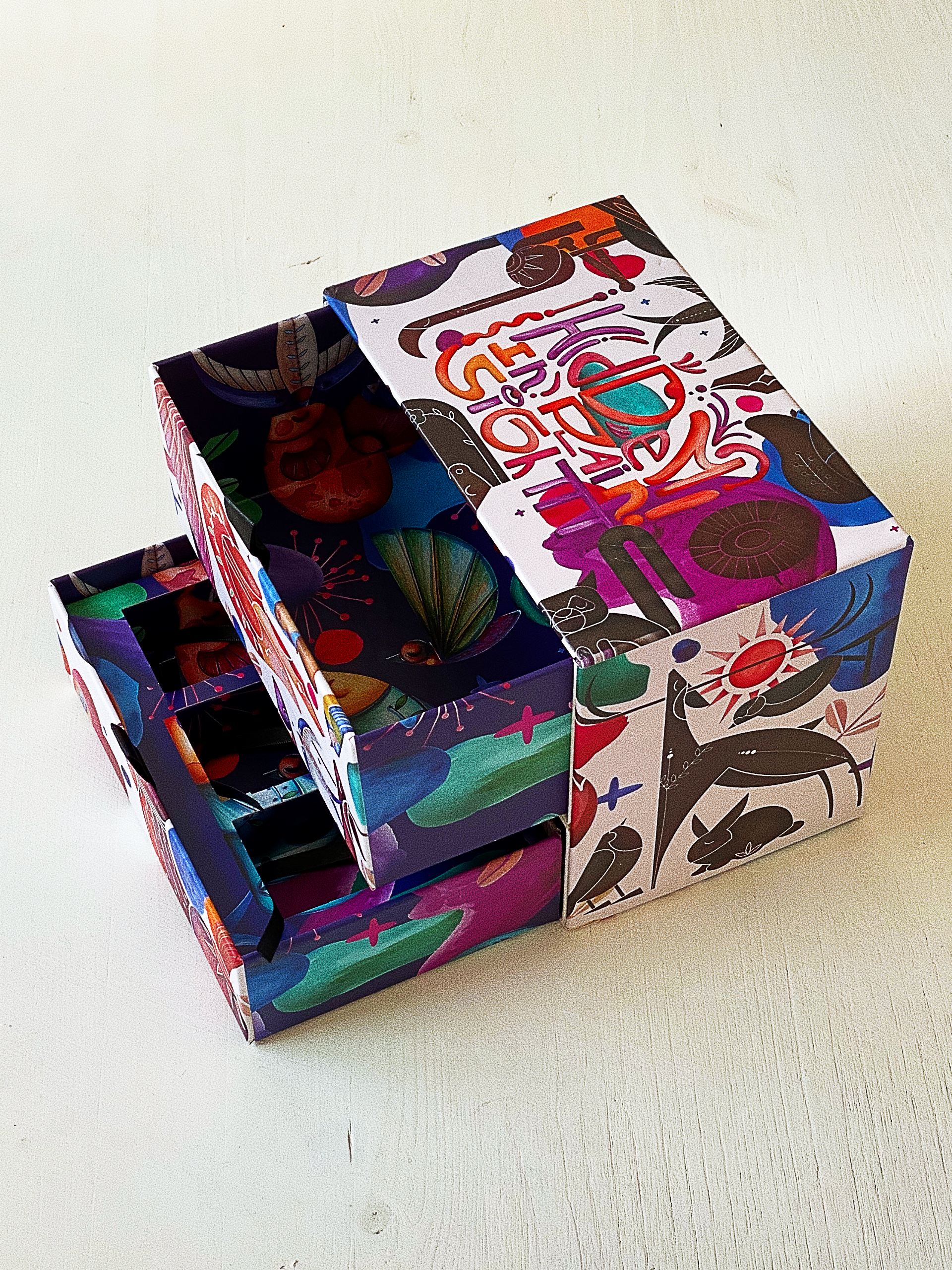
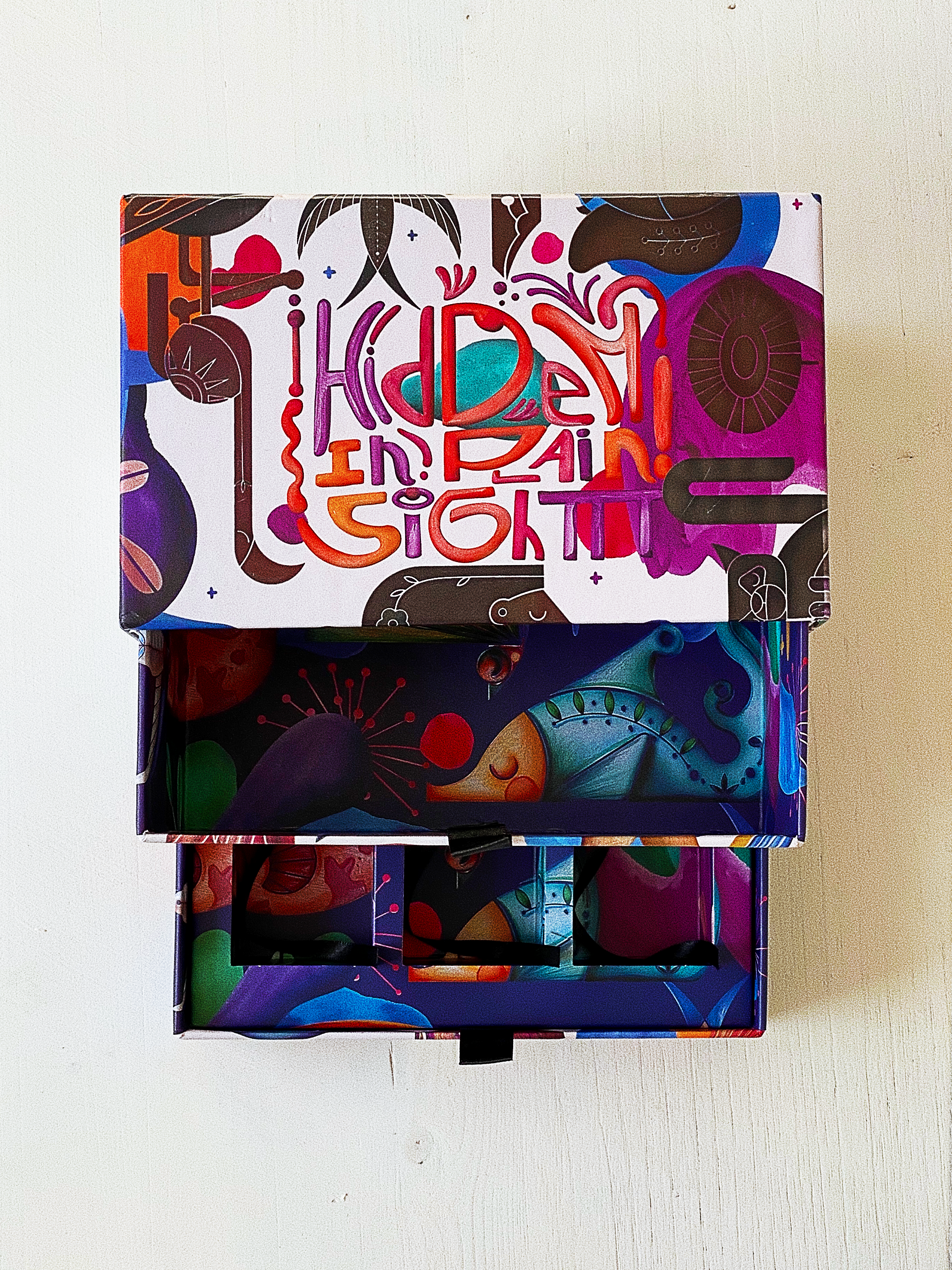
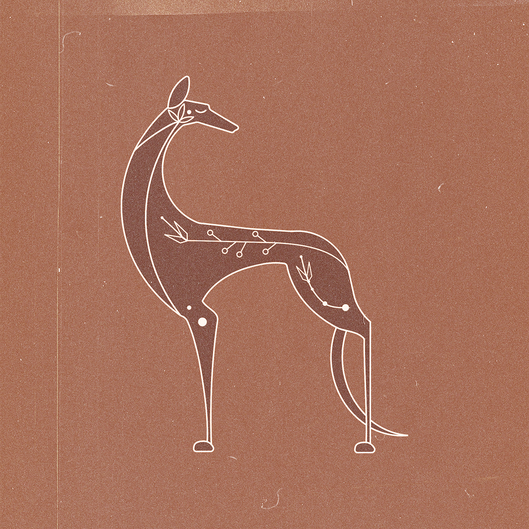
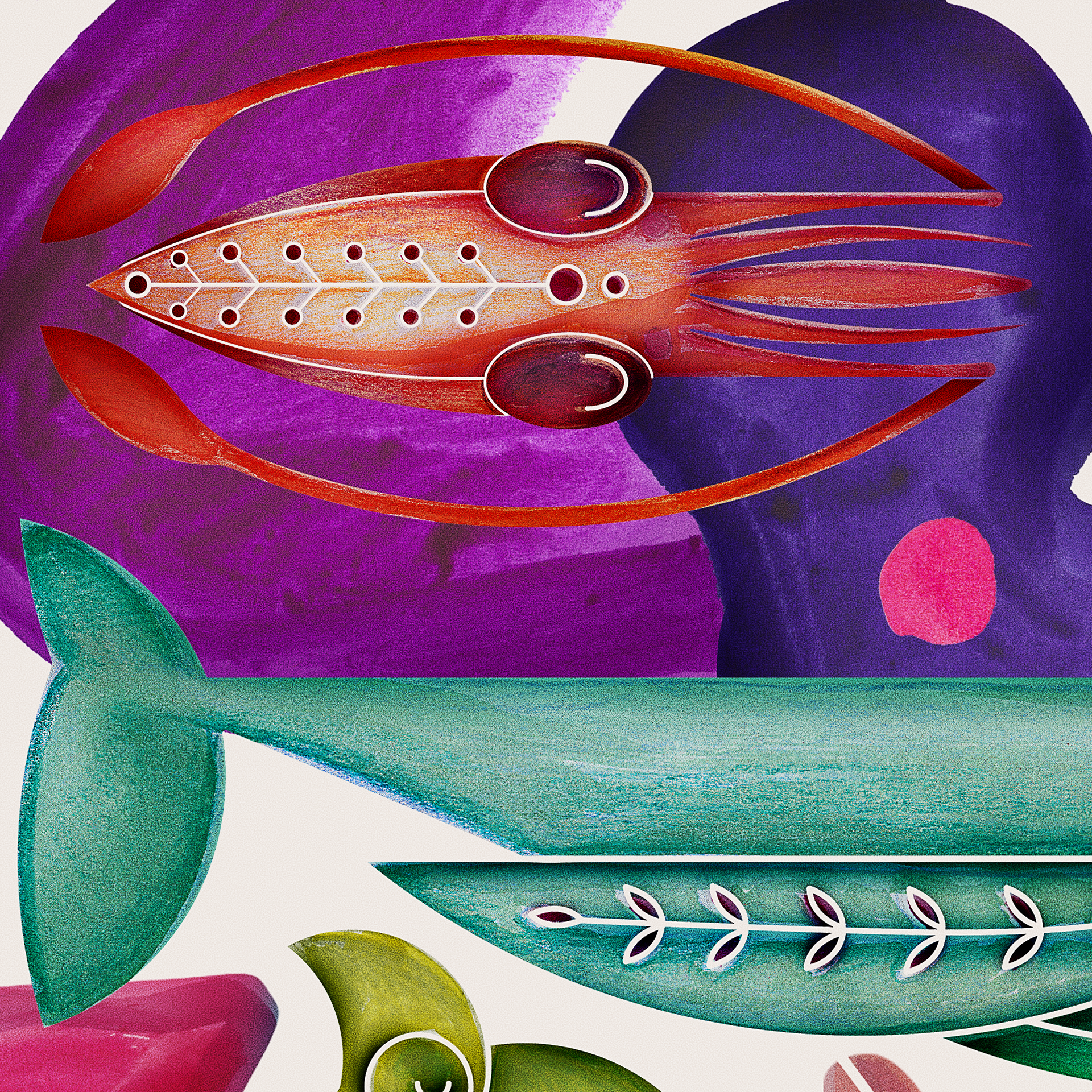
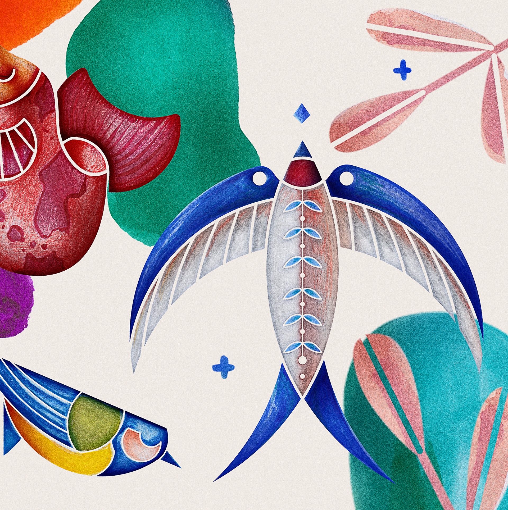
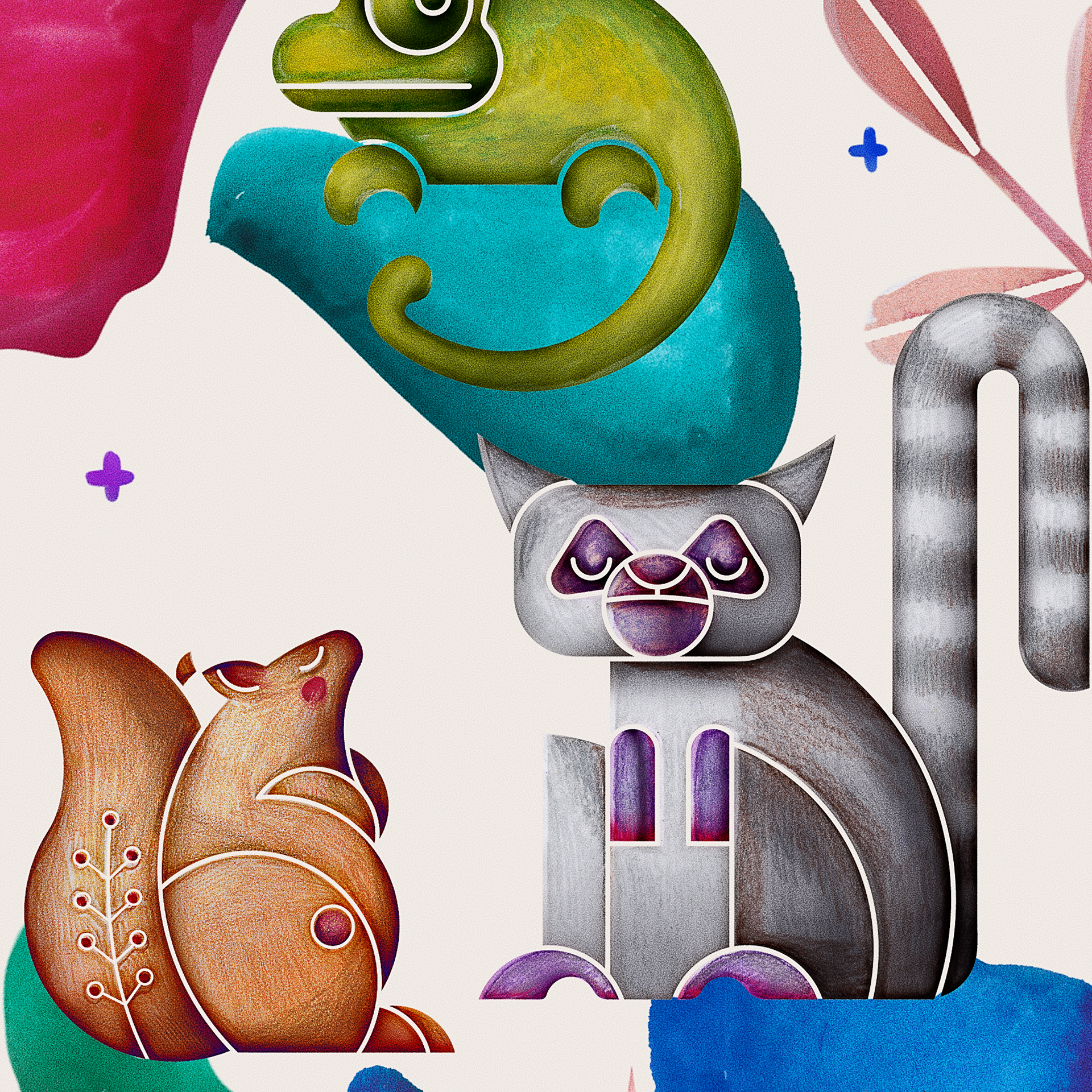
Having this main task of translating this brand message in a visual language I turned to one very special technique which uses a double layered print - one in a regular printing method, while the second layer is masking main elements with thermo ink. Thus hiding in plain sight vibrant colours and animals that are creating the pattern.
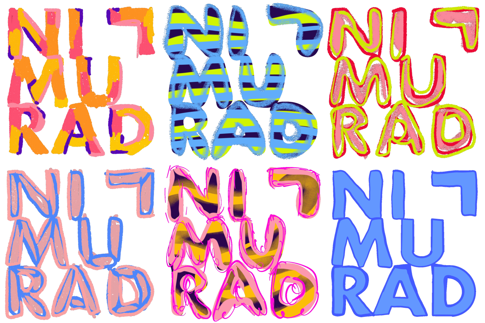
Title treatment
Final packaging design with the thermo ink activated with heath, revealing the vibrant colours beneath
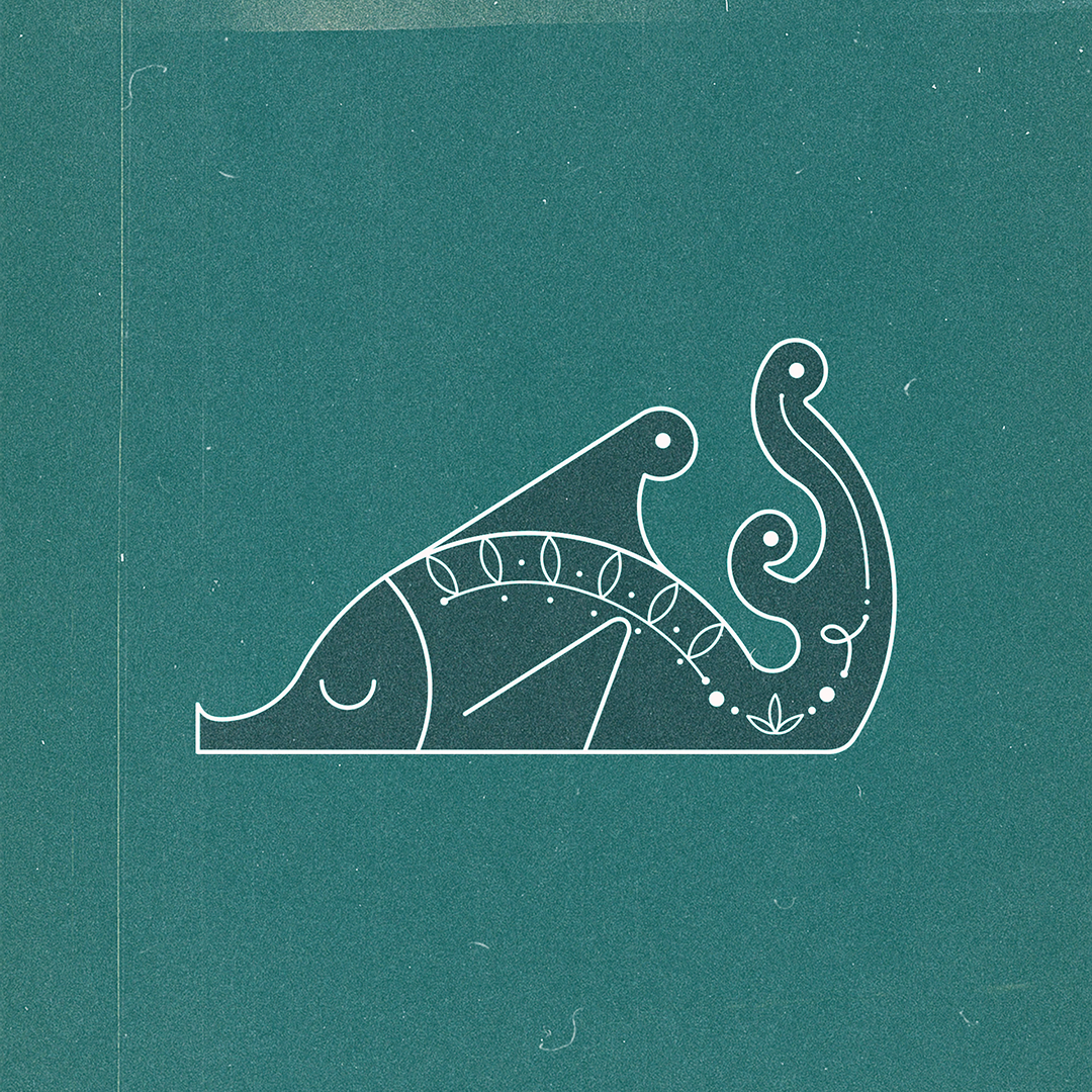
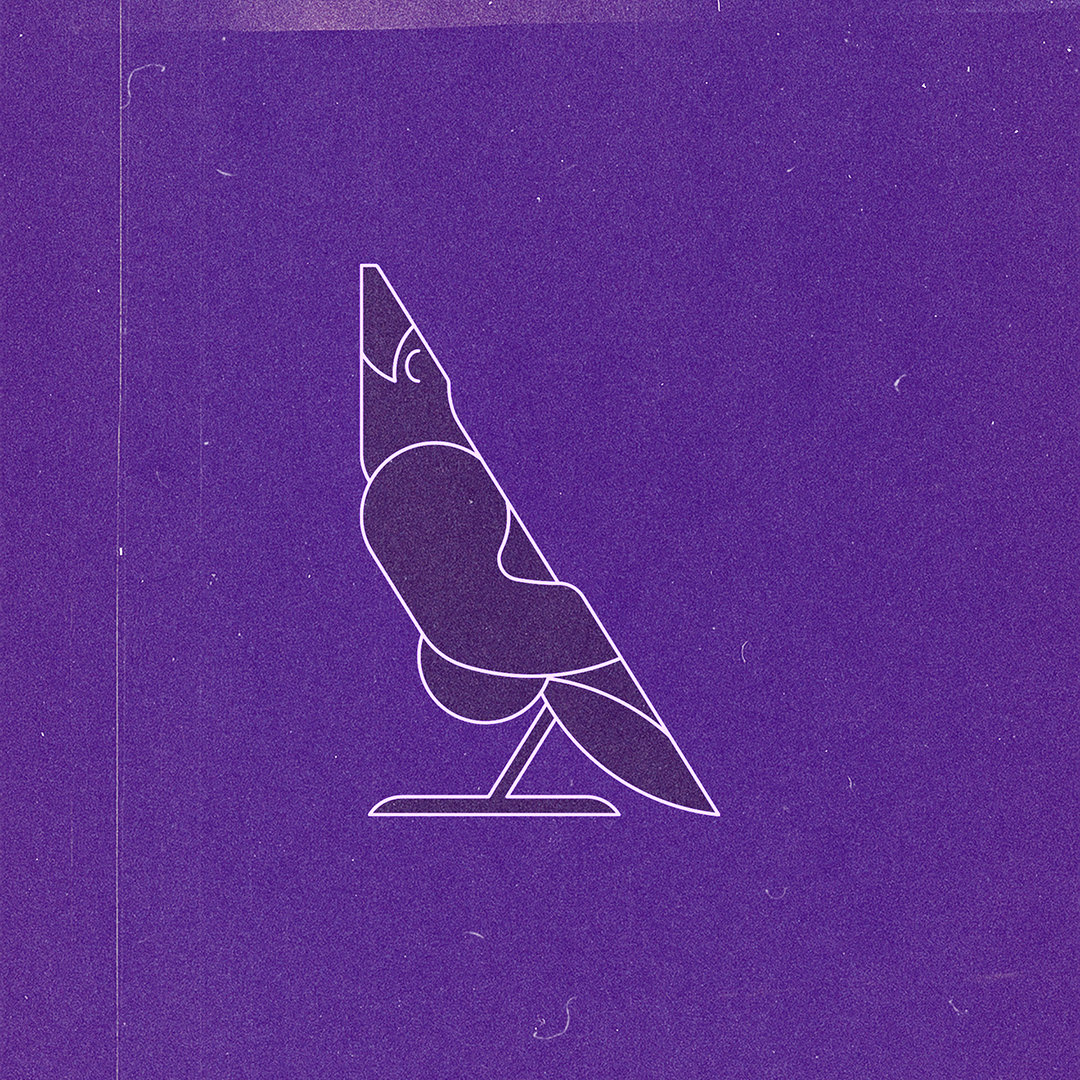
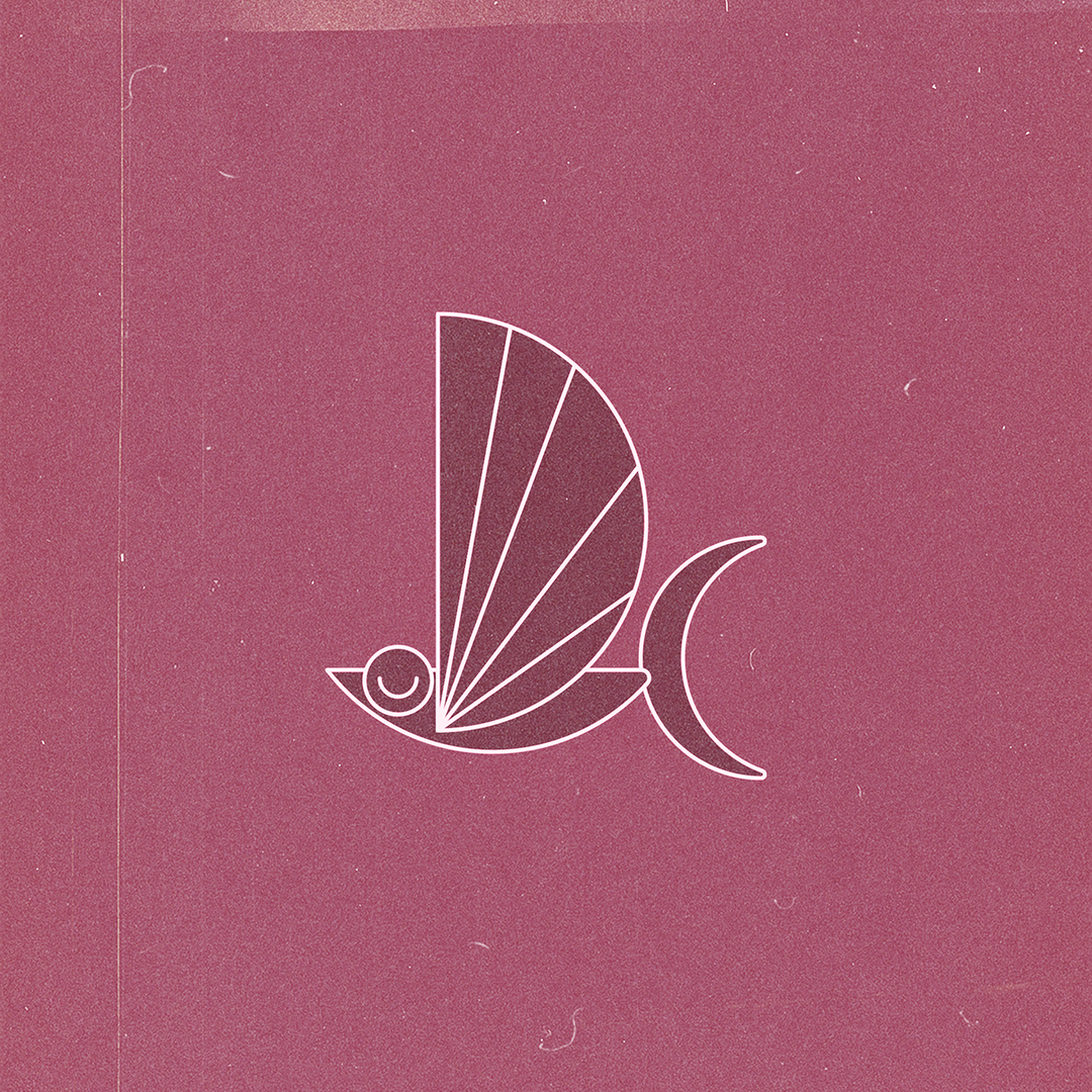
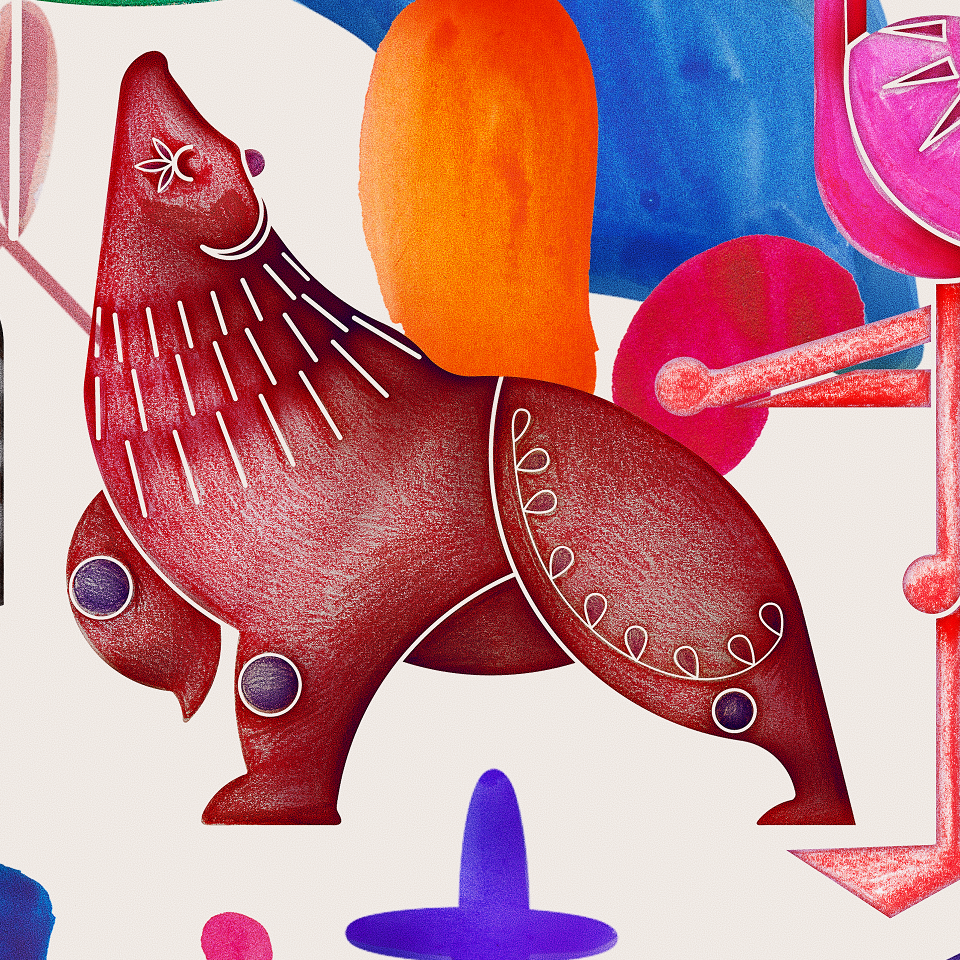
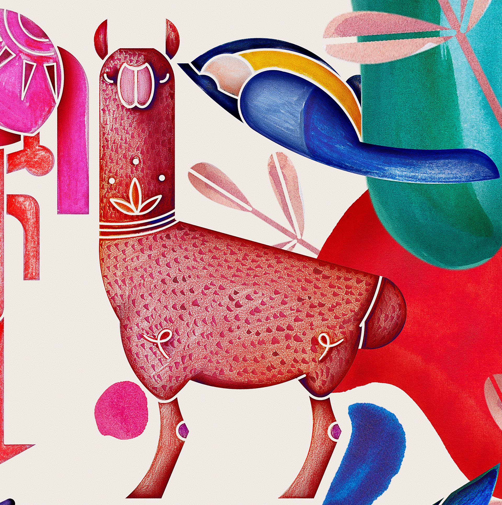
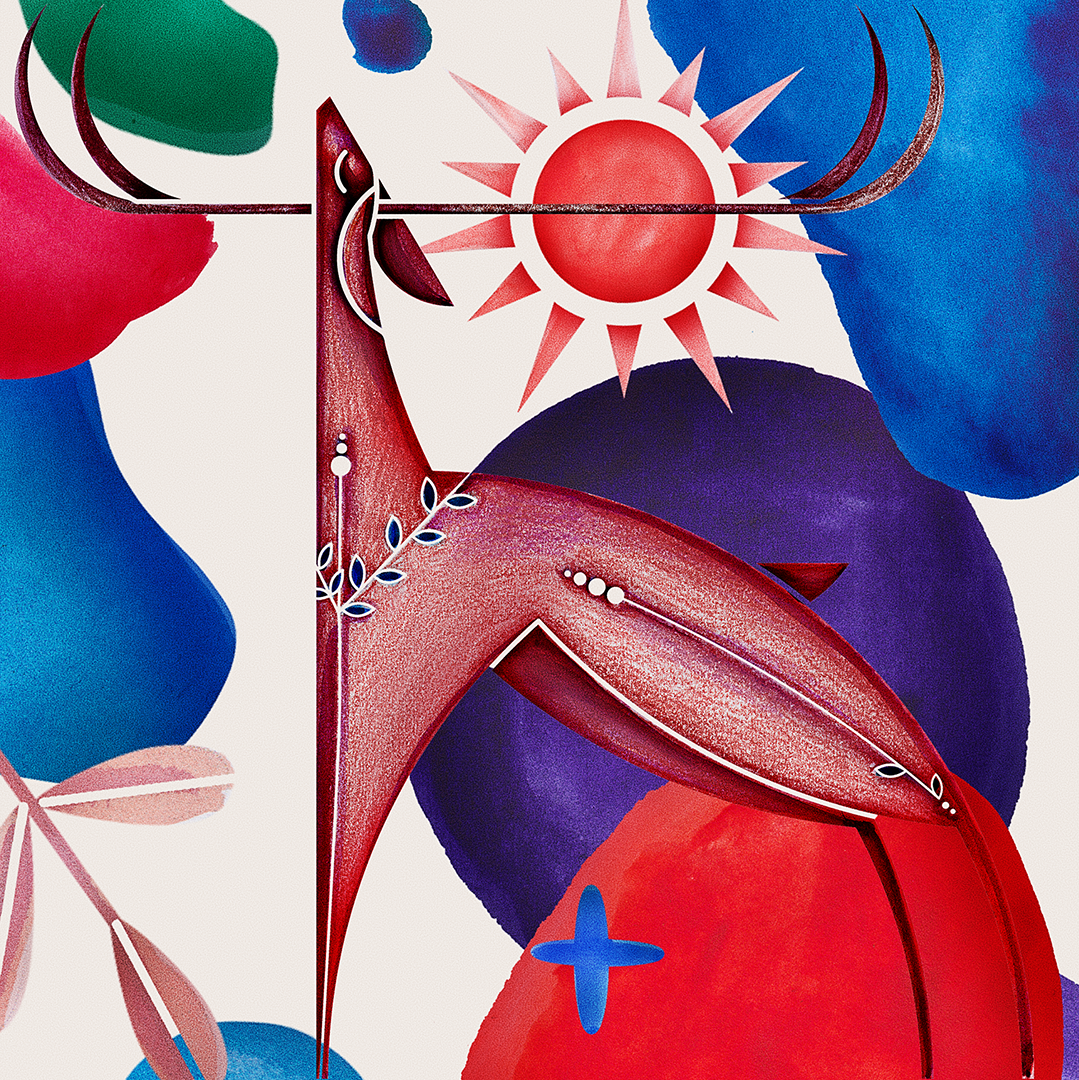
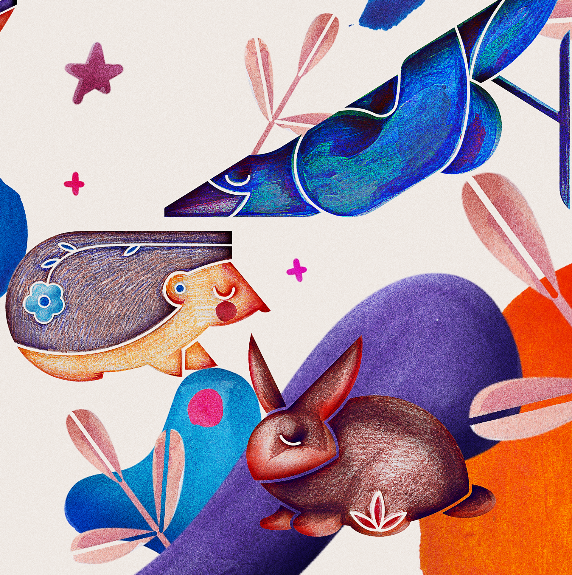
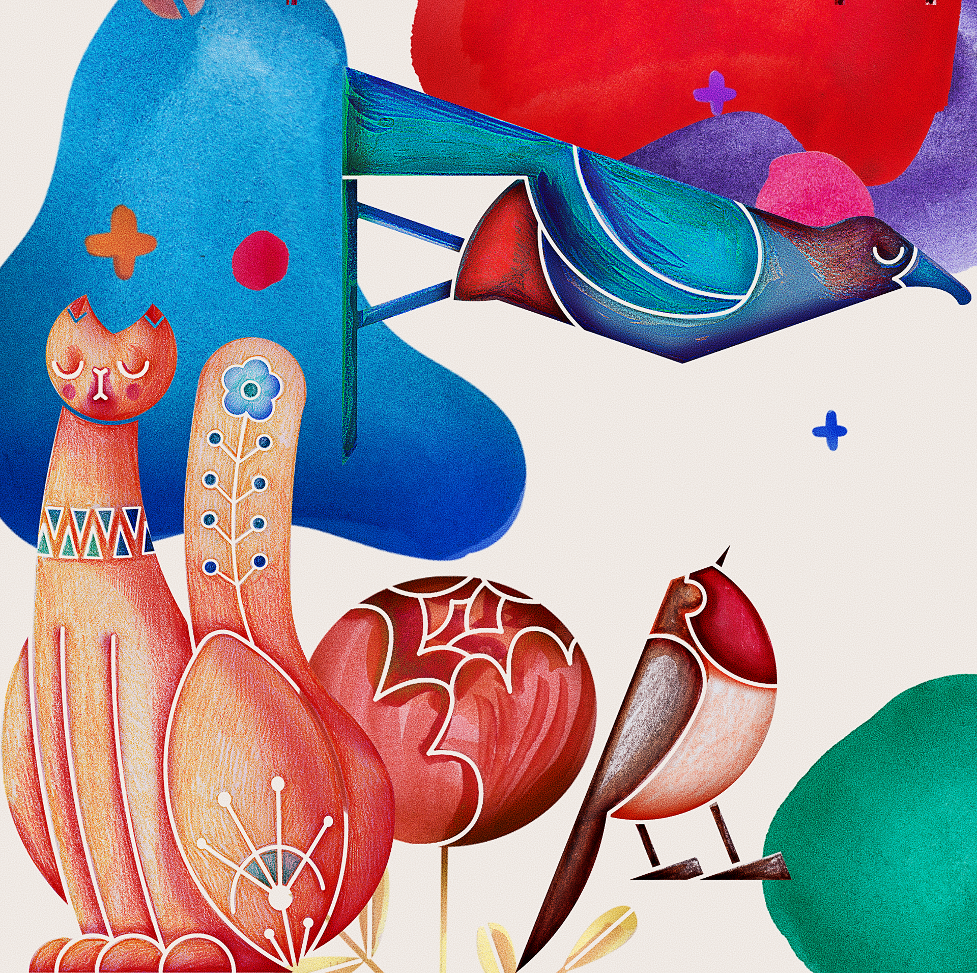
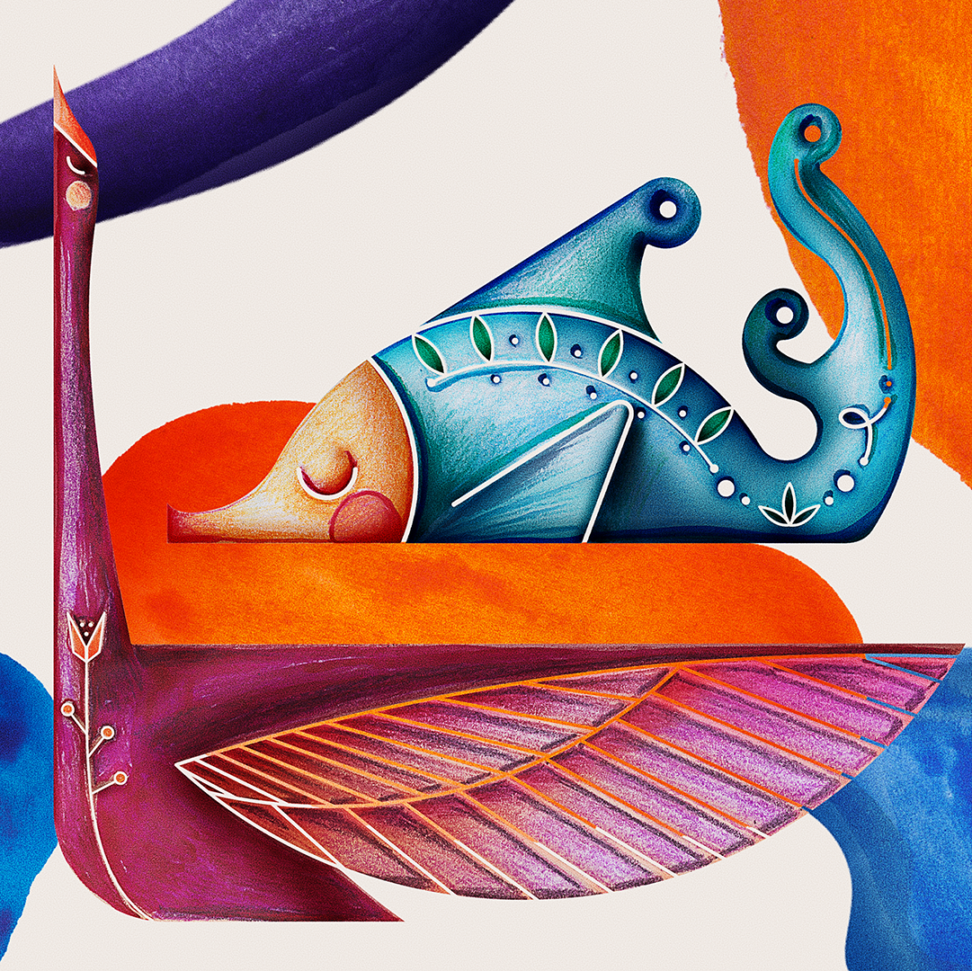
Animal design and pattern details








Packaging design simulations, and final product
